Portfolio / Case Study
Enterprise UX Research-Led Design H1 Initiative Usability Testing Platform Scalability

Audit Client Portal - Customer Experience Redesign

How we discovered that a portal's real problem was not navigation or broken features, it was that neither auditors nor clients could see the same picture at the same time.
Client Ernst & Young
Timeline July 2023 - February 2025
My Role Experience Design Lead
Platform Client portal · Global Audit Platform
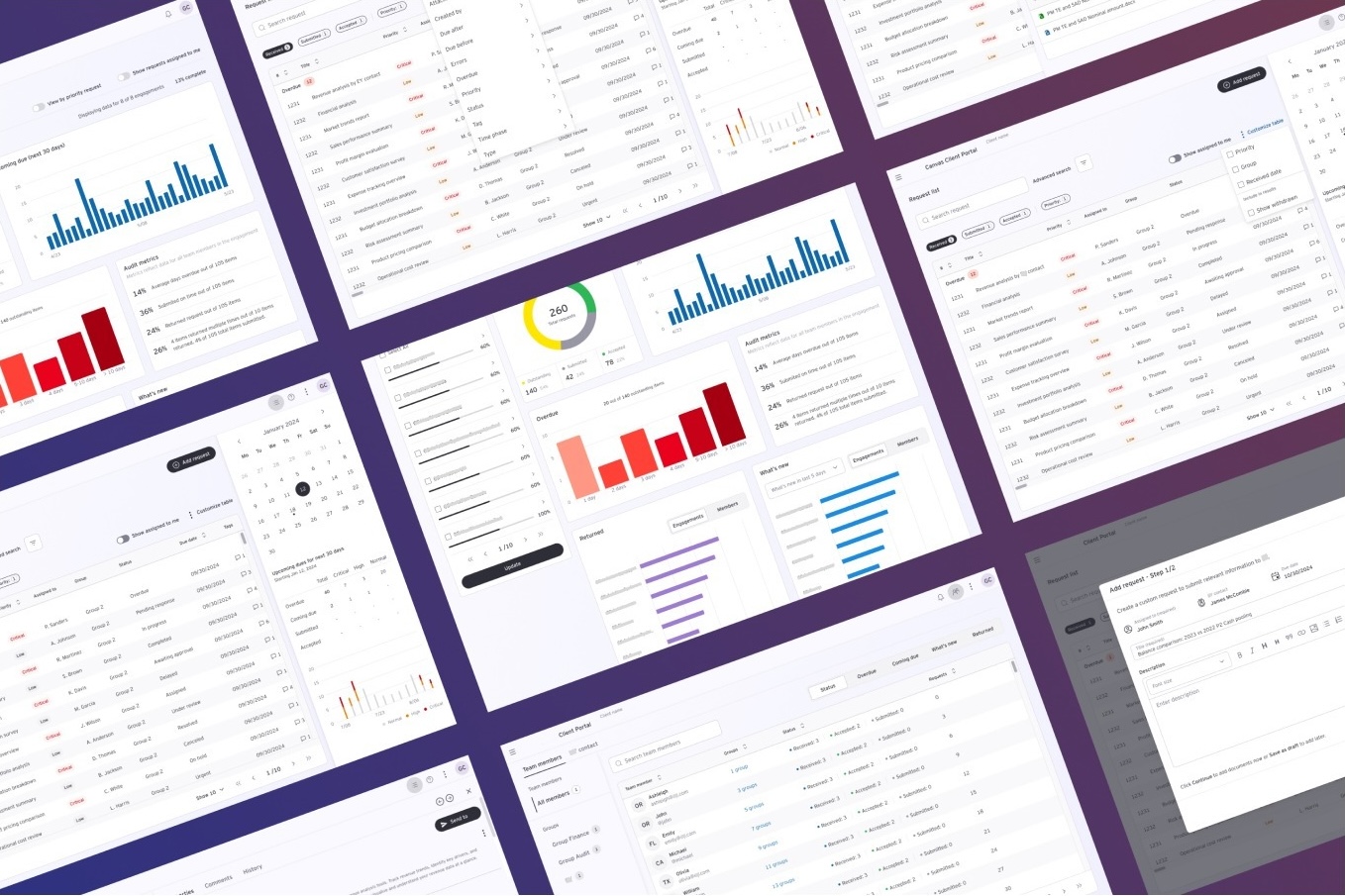
EY Audit Client Portal redesign overview
45%
Blended UX score
uplift (BUX)
50%
Usability metrics
improvement
64%
NPS score
(target was 50)
82%
User reported
Time Saving
01

The problem - and the problem behind the problem

The brief was clear: the Client Portal had usability issues. Navigation was confusing, the issue tracker was cumbersome, and clients were struggling to complete requests. Fix those things and the portal would perform.

The brief was wrong. Or rather, it was incomplete.

When we started talking to users, a pattern emerged that no ticket or stakeholder briefing had captured: clients were not struggling with the portal because of bad UI. They were avoiding it entirely. The portal was not their platform, it was an external company's system that they were expected to learn and use infrequently, under time pressure, for an audit they did not fully understand.

"The average client user's attitude to the portal was avoidance, it was too confusing and daunting. This is not their own work platform, but an external company's platform."

— Research finding, Discovery phase

The consequence was systemic: coordination defaulted to email. Audit teams spent time chasing clients through a channel they had no visibility into. Requests fell behind. Trust eroded on both sides.

The real problem: neither party had a shared, unambiguous picture of what was outstanding, what was urgent, and what was coming due. That shared visibility was what the redesign needed to create.

Problem Map Audit Team Senior / Staff Auditor Client User Operations / VP Finance Client Portal Document repository Confusing · Avoided Email ↩ Default fallback No shared visibility Result: Requests overdue · Trust erodes Audit teams chase via email · More friction

Problem space - portal avoided, email becomes default, visibility gap widens

02

My role and how the team worked

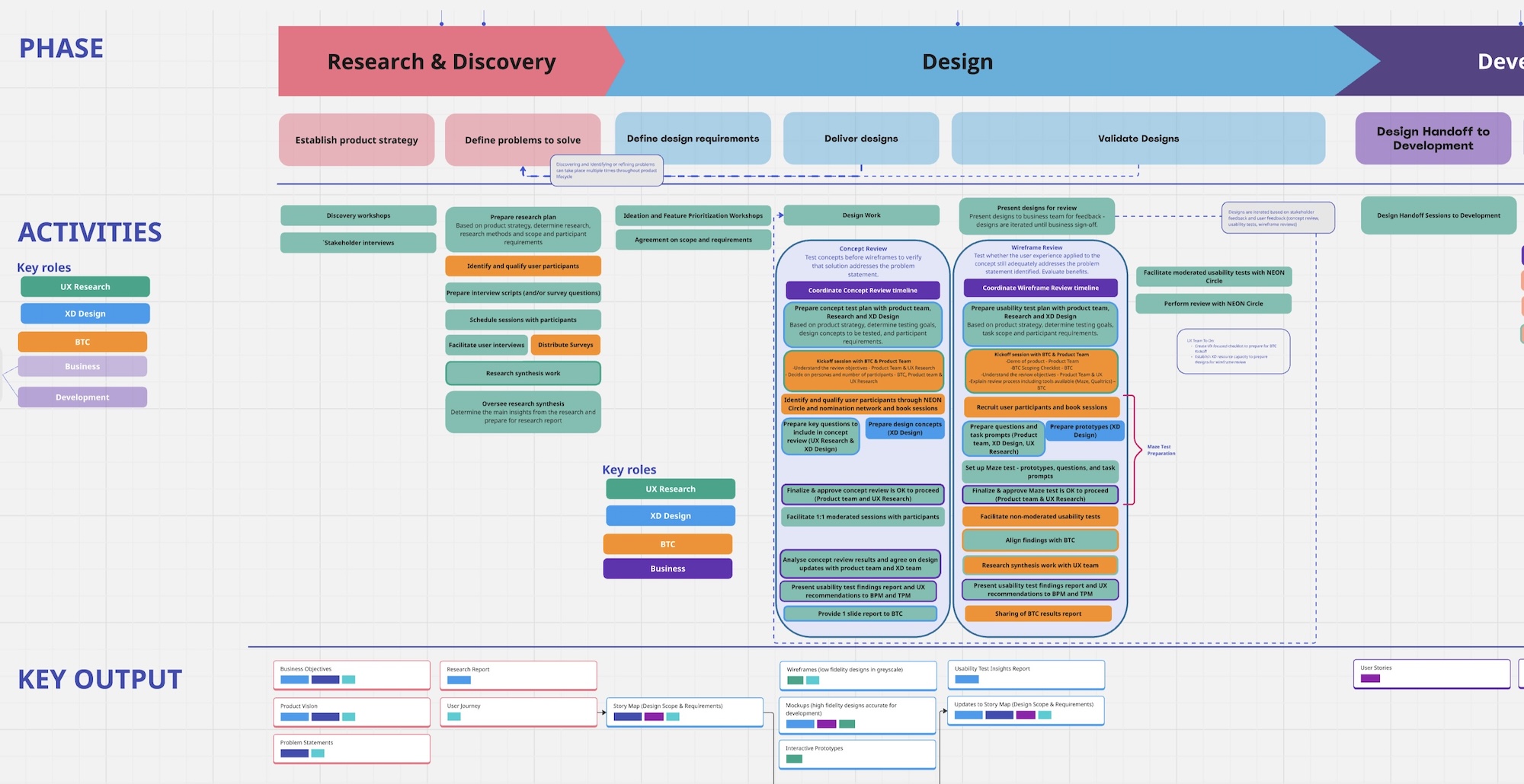
As Experience Design Lead, I owned the end-to-end UX process, from discovery through to production handoff, working within a cross-functional team that spanned UX research, product management, engineering, and business stakeholders.

I led the research phase jointly with a fellow researcher, designed the study protocol, facilitated stakeholder workshops, produced all wireframes and prototypes, and coordinated the usability testing sessions.

Stakeholder alignment was a critical part of the role. The redesign touched multiple product teams and business sponsors across EY globally.

Teams & Collaboration
  • UX Researcher
    Client user interviews, research synthesis, insight generation
  • Business Product Manager
    Prioritization, roadmap alignment, business strategy
  • Technical Product Manager
    Feasibility assessment, implementation planning
  • Audit Partners
    Audit process expertise and solution validation

Experience Design Lead (Me)

  • Discovery & Research
    1:1 interviews with auditors across four seniority levels and three geographies (APAC, US, EMEIA)
  • Journey Mapping
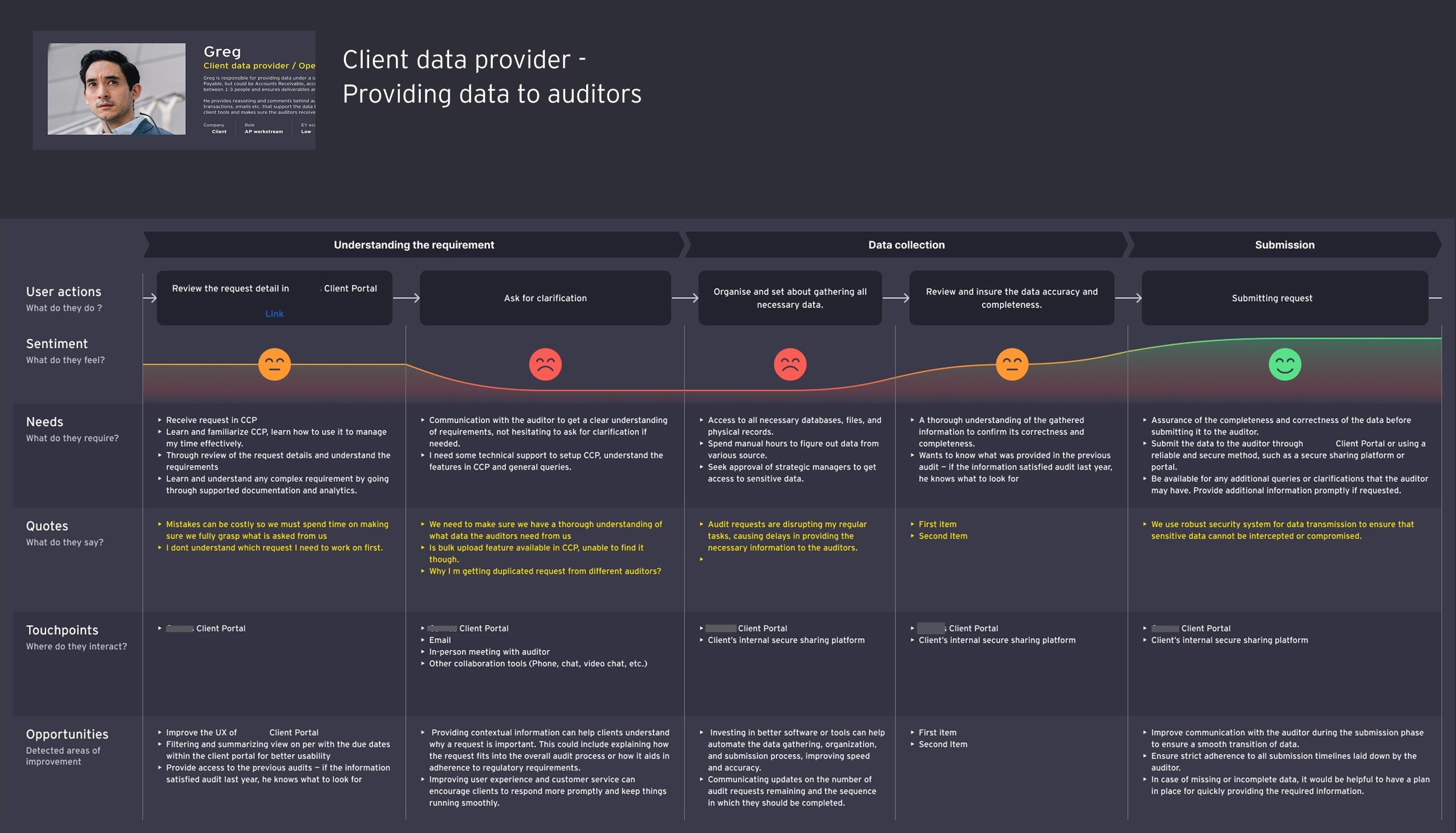
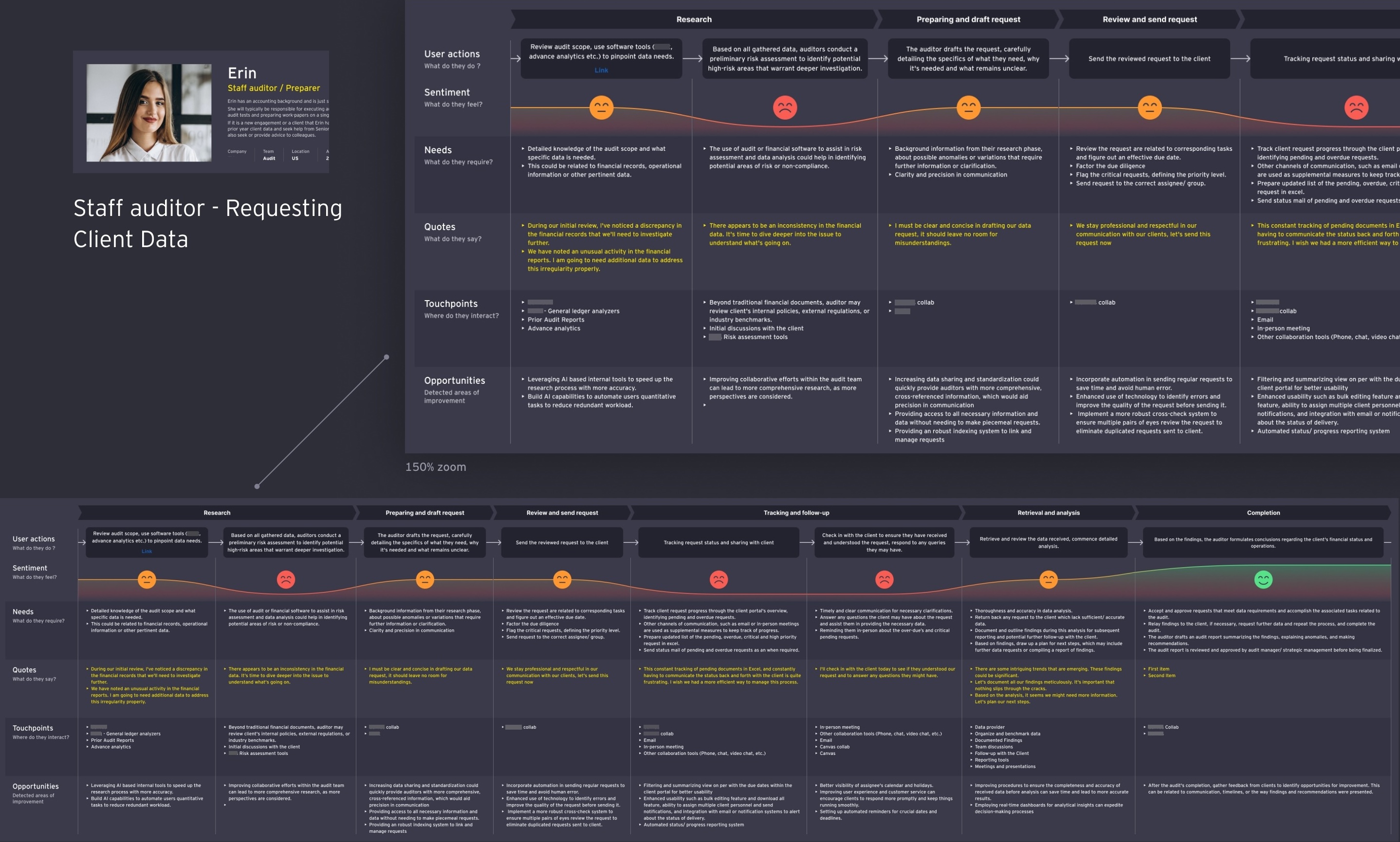
    Mapped two user paths: Staff Auditor requesting client data, and Client Data Provider fulfilling requests
  • Ideation Facilitation
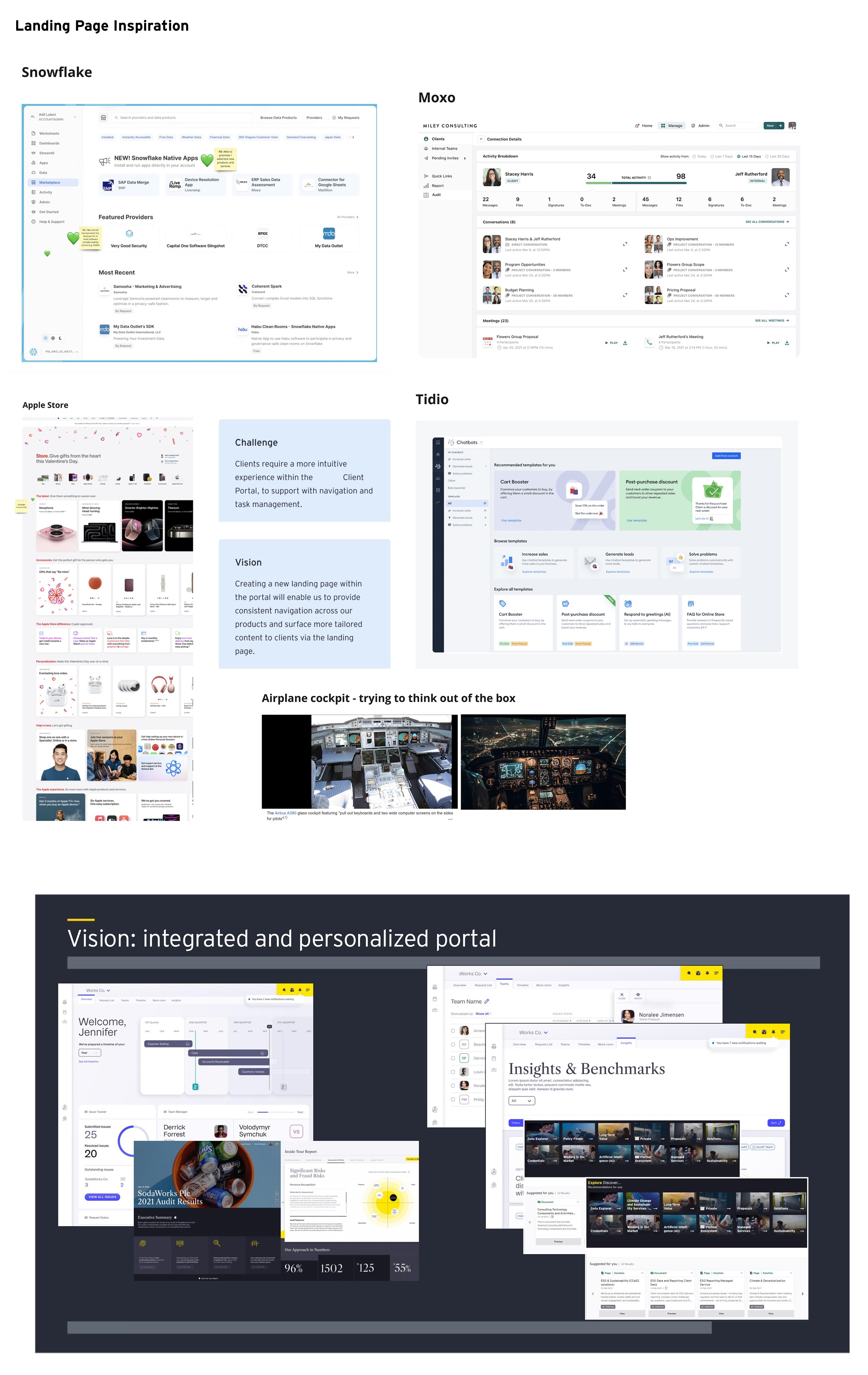
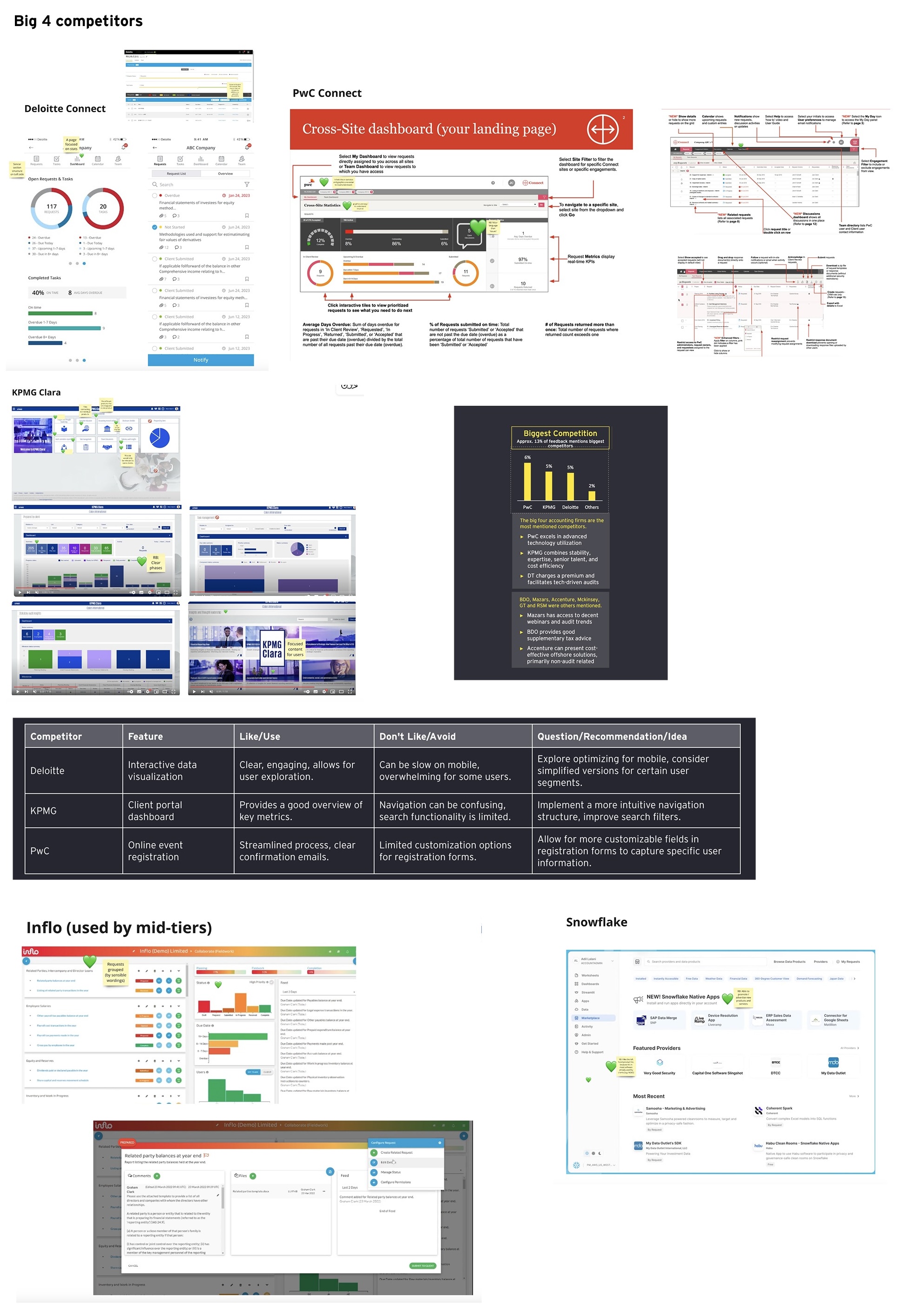
    How Might We workshops, competitor analysis, decision tree sessions with product and business stakeholders
  • Prototyping
    Two competing design concepts taken to wireframe quality for user testing
  • Usability Testing
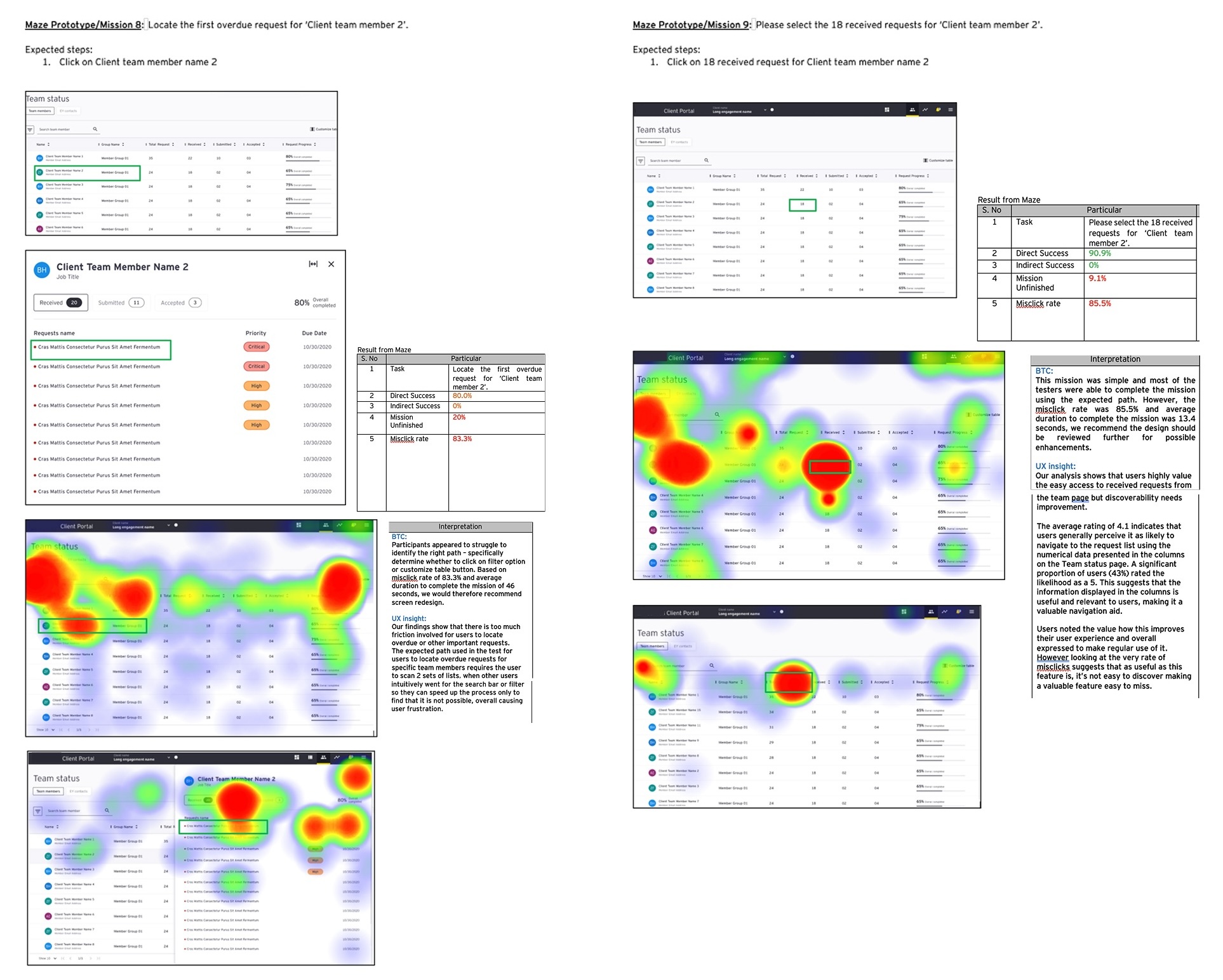
    Validated wireframes with cross-geography participants; moderated sessions and synthesised findings
  • Design System Contribution
    Extended Motif design system component library to support new interaction patterns
  • Dev Handoff
    Detailed Figma specifications and collaboration with engineering leads through implementation<
03

Discovery - what we found when we looked

The discovery phase was designed around a single question: how do auditors and their clients actually coordinate on request completion, and where does that process break down? We ran a series of 1:1 user interviews across seniority levels and geographies before a single design decision was made.

1
Stakeholder
interviews
2
User
interviews
3
Journey
mapping
4
Competitor
analysis
5
Synthesis
& personas
Infrequent users demands radical simplicity
Client users are not regular portal users. Unlike auditors who use the platform daily, clients access it sporadically under time pressure. This made any learning curve unacceptable, the experience had to be immediately clear on every visit.
Email was the real benchmark
Auditors found email faster for following up with clients. Not because email is better but because it requires no learning and creates a direct, personal alert. The portal needed to match that sense of directed urgency to displace it.
Two personas, one shared goal
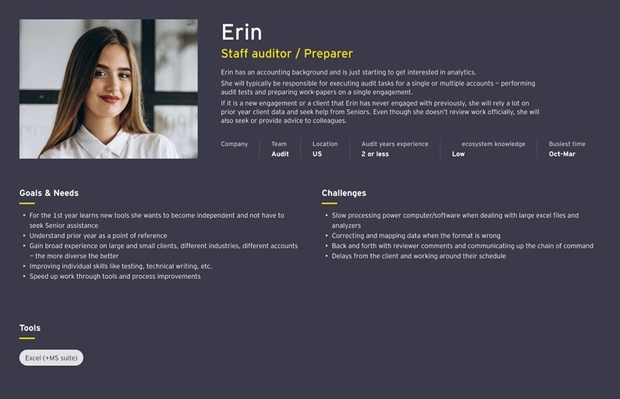
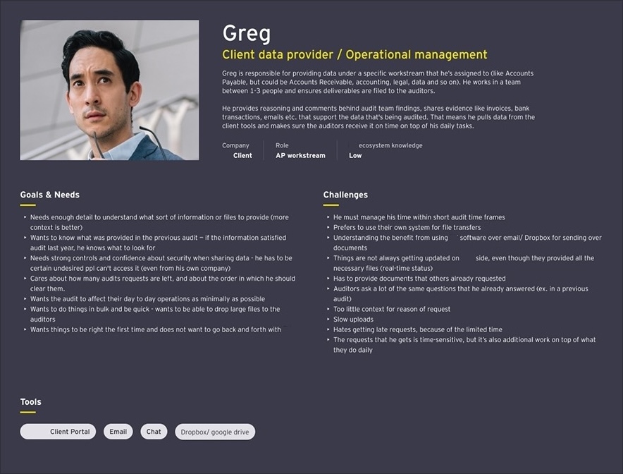
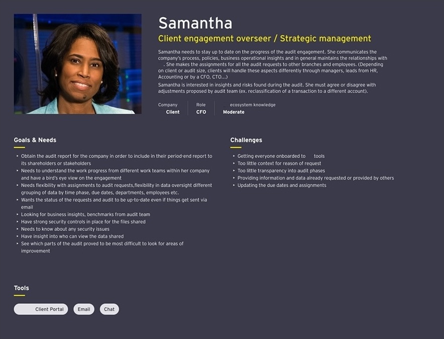
We identified Operational Managers (day-to-day request managing on client sides) and Senior Planners (strategic overview, team performance). Both shared a primary goal: get audit requests completed on time so the audit progresses smoothly.
Persona A : Operational Manager Greg Operations Manager · Client Side Visits portal 2–3× per audit engagement GOALS → Know exactly what is outstanding and by when → Submit the right documents on time → Communicate clearly with audit team without extra steps PAIN POINTS ✕ Portal is daunting, defaults to email instead ✕ Cannot see which items are truly urgent at a glance ✕ Audit stages and jargon are unfamiliar ✕ Feels like extra work on top of their own job
Persona B : Senior Planner Samantha VP Finance · Client Organisation Needs strategic overview, not operational detail GOALS → See overall audit progress at a glance → Identify risk areas and bottlenecks early → Understand team performance and engagement PAIN POINTS ✕ High coordination effort across stakeholders and deadlines ✕ Redundant work from disconnected data and tracking ✕ Operational friction compounding audit delays and costs ✕ No ability to drill from summary to detail
Simplified User Journey : Client Data Provider NOTIFIED ACCESS UNDERSTAND RESPOND CONFIRM Gets email from auditor Logs into portal (or not) Tries to find their requests Uploads documents Waits for confirmation 😐 Neutral 😕 Frustrated Portal avoidance Confusing navigation Opportunity: clear confirmation Emotional curve Pain point

Journey map : Client data provider fulfilling audit requests · Key pain points clustered around portal access and navigation
04

Defining direction - from research to design bets

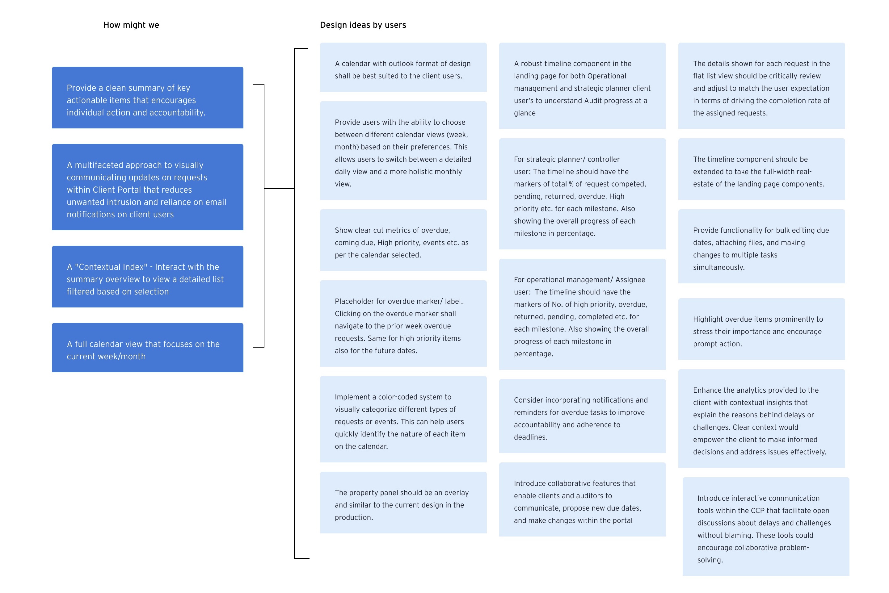
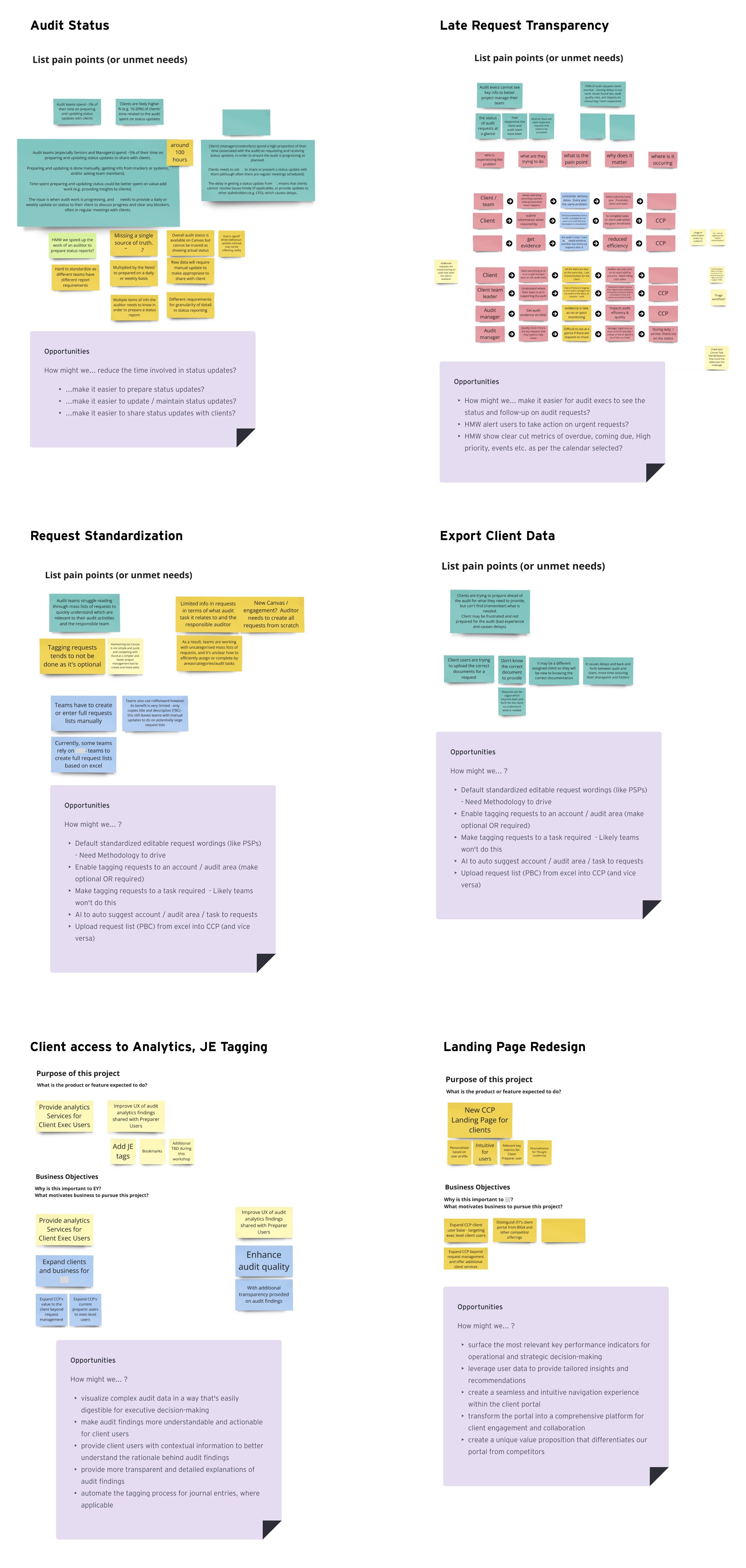
With research synthesised into clear user needs, we ran structured ideation sessions using How Might We questions to convert problem areas into design opportunities. These were then filtered through stakeholder workshops and a decision tree to determine which opportunities had both the highest user value and business viability.

How might we reduce the time audit teams spend on manual status updates?

Audit Status

How might we show clear metrics on overdue, coming due, and high-priority items at a glance?

Request Visibility

How might we give clients contextual information to understand audit findings without needing a tutorial?

Client Analytics

How might we surface the most relevant KPIs for both operational and strategic decision-making?

Landing Page

How might we create a seamless navigation experience that requires no re-learning on each visit?

Navigation UX

How might we allow bulk actions on requests to reduce individual task overhead?

Request Management

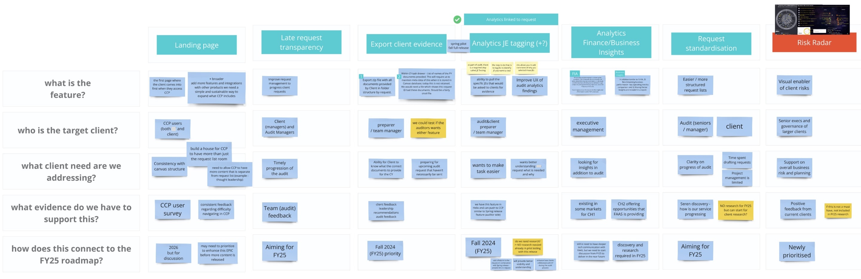
Feature prioritisation through stakeholder consensus

I used a structured decision tree approach with stakeholders: each potential feature was evaluated against evidence from user research findings during workshops. This meant that by the time wireframing started, there was existing agreement on what to build and why.

Features were scoped across three horizons: Autumn 2023 (foundational UX), Spring 2024 (analytics and calendar), and beyond (risk radar, client priorities tracking, ecosystem expansion).

Feature Decision Tree - Simplified User Research Finding Evidence-based entry High user value + Low effort High user value + High effort Low user value De-prioritise NOW · Autumn 2023 NEXT · Spring 2024 Landing page redesign Timeline · Calendar view Voice notes · Multi-assignee Client analytics access JE tagging · Risk radar Export · Calendar view Spring 2024

Feature decision tree : structured consensus before design began
05

Design, testing, and what we were wrong about

Two competing design concepts were taken to wireframe quality for user testing, a Calendar concept and a Timeline concept. Each approached the core problem from a different angle. We had a hypothesis about which would win. The users told us something more interesting: both were partly right, and neither was sufficient alone.

Timeline Concept Foundation - iterated
Overall audit progress: 62% Audit Phases 12 Overdue 8 Coming due 34 Outstanding 54 Completed ● Q3 Financial Statements - OVERDUE · 3 days ● Board Resolution Copy - Due in 2 days ○ Bank Reconciliation Dec - Due in 8 days Clear hierarchy · Easy to scan · Actionable

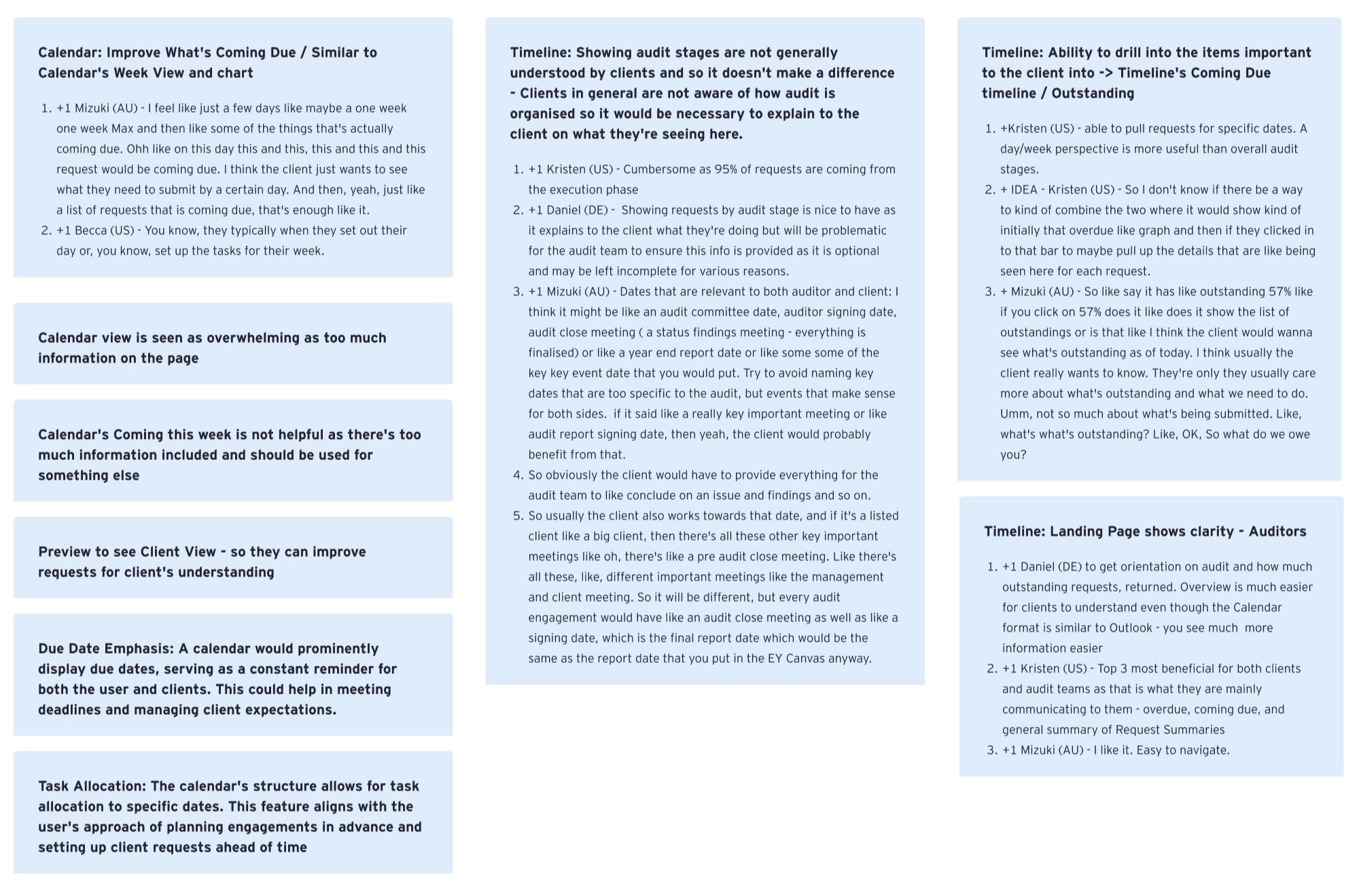
Showing stages are not generally understood by the client data providers

Summary stats (overdue, coming due, outstanding) tested as the three most useful data points for both sides

Drill-down from summary to filtered request list was highly requested, users wanted the macro, then the micro

Calendar Concept Partial - reworked
Mon Tue Wed Thu Fri Sat Sun Too much information · Client feedback 2 Overdue 2 Overdue 2 Overdue

Calendar view was seen as overwhelming, too many items visible simultaneously without hierarchy

Familiar mental modal but week view did not help clients focus on what matters right now

Useful insight retained: due date emphasis and week-level planning were genuinely valued, this was extracted into the final design
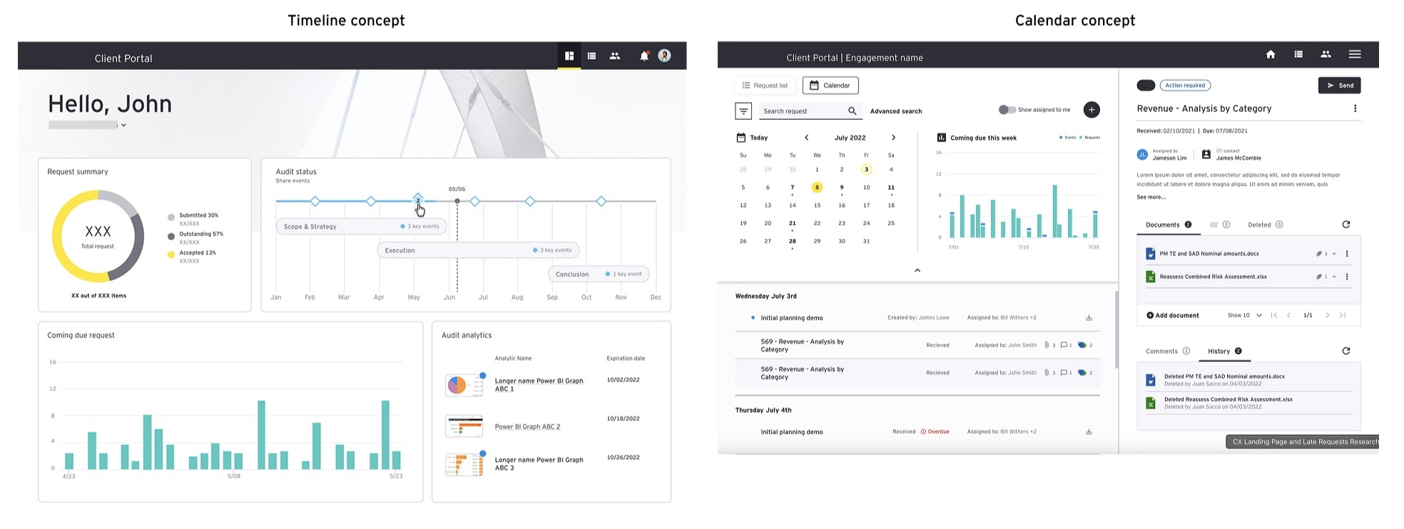
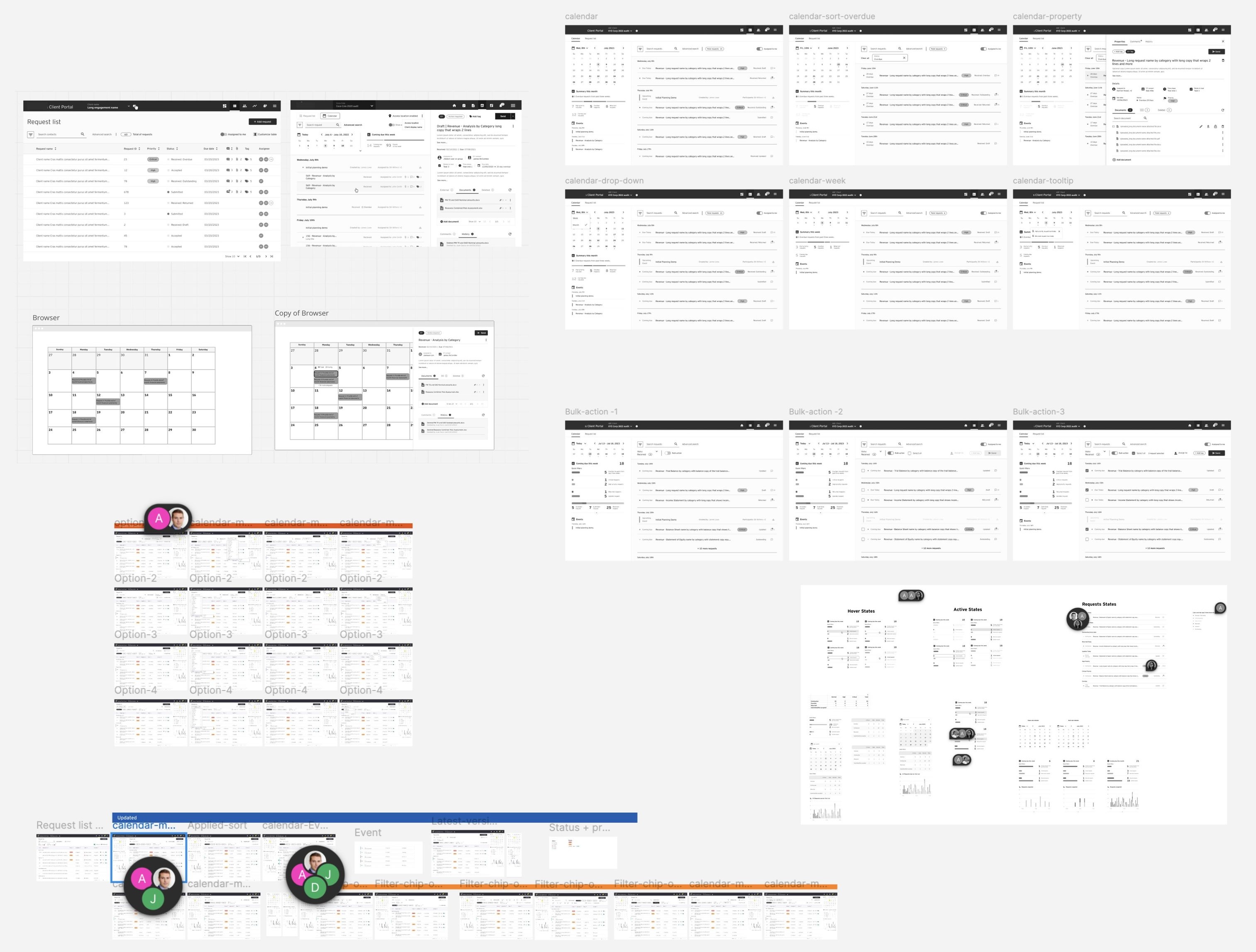
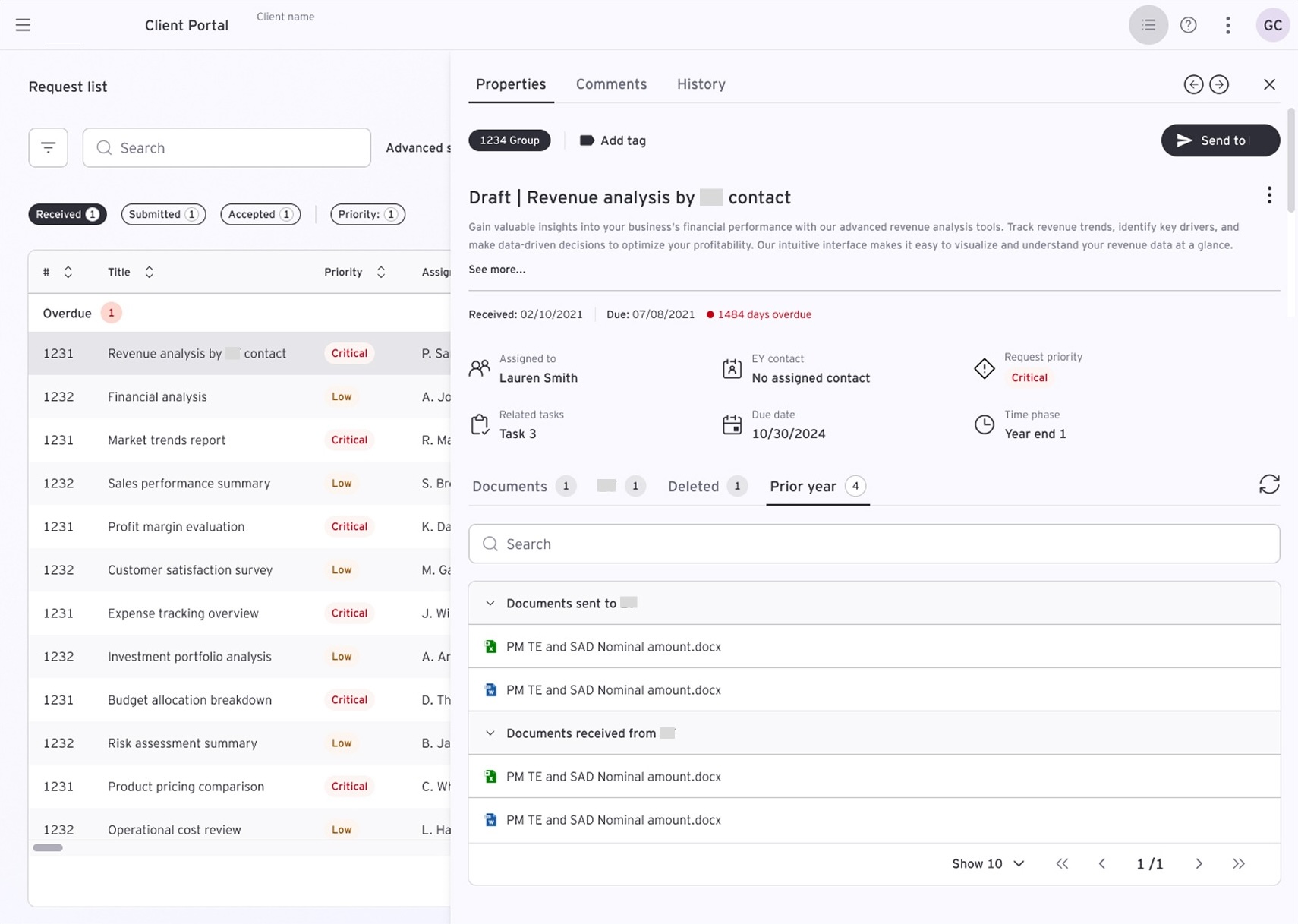
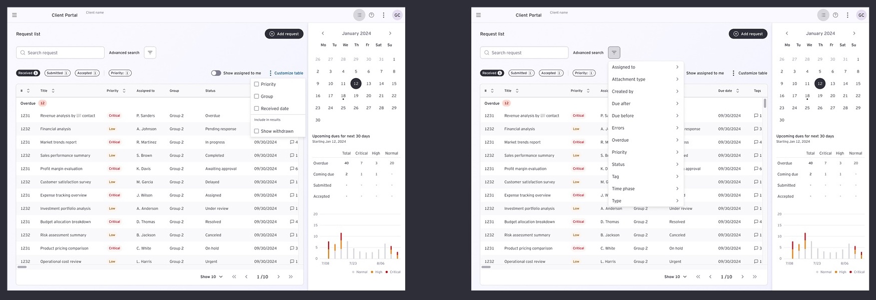
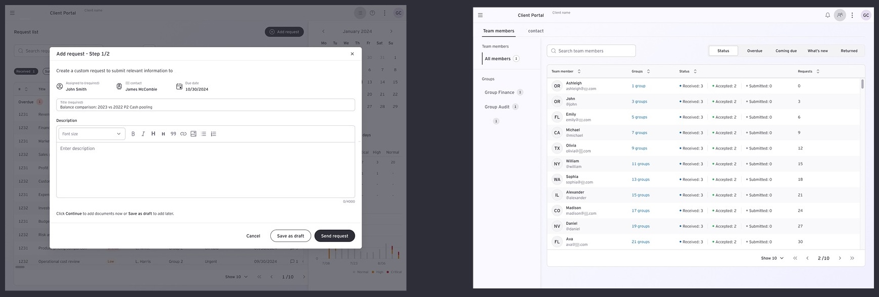
Client Portal wireframes and design exploration
Timeline and Calendar concepts side by side

"Top three most beneficial for both clients and audit teams: overdue, coming due, and general summary of request status, that is what they are mainly communicating on anyway."

— Kristen (US), Usability Testing Participant

The solution that emerged was not either concept, it was a synthesis. The Timeline's summary statistics and progress arc became the spine of the redesigned landing page. The Calendar's week-level focus was preserved as a secondary view mode, specifically for client data provider users who think in terms of deadlines rather than milestones. The key design move was building a contextual index: clicking any summary stat filters the request list, giving users the macro picture with one-tap access to the micro detail.
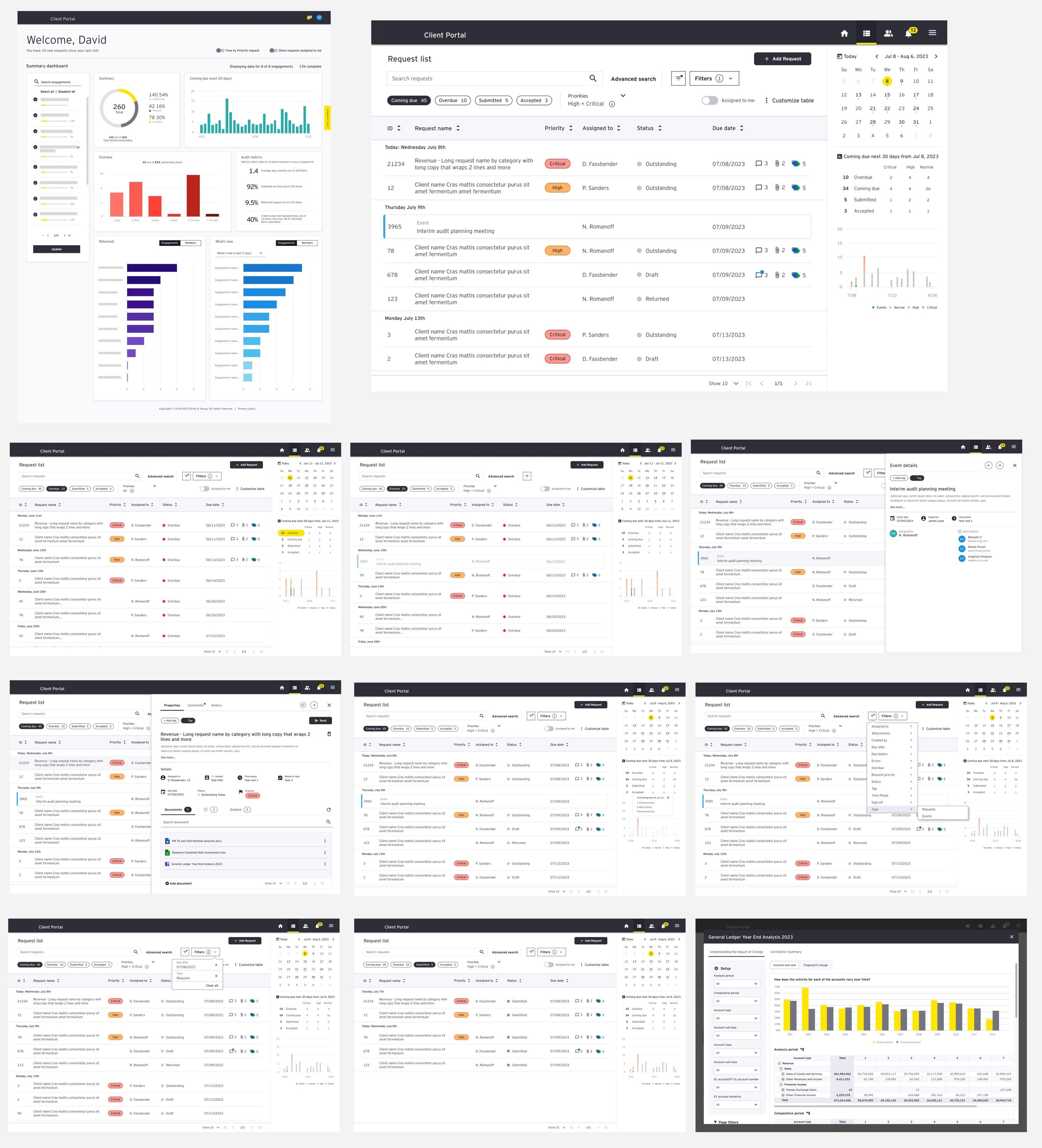
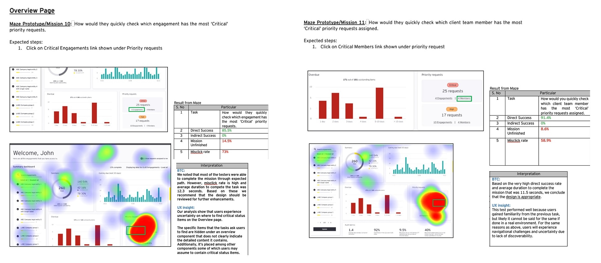
Client Portal wireframes and design exploration
Wireframes ready for testing
Client Portal wireframes and design exploration
Usability Testing : Validated wireframes with cross-geography participants; moderated sessions and synthesised findings
06

Before & After Value Comparison

Evaluating the transformation side-by-side demonstrates how transitioning from a disjointed document index to a structured tracking strategy directly solved coordination friction across both client and auditor personas.

Legacy Directory Architecture (Before) Disjointed Index

The Friction Window: An opaque file management library. Client users faced ambiguous directory strings, nested hierarchies, and a total lack of status confirmation markers. Coordination naturally collapsed into manual email loops.
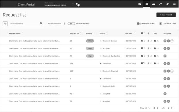
Client Portal wireframes and design exploration
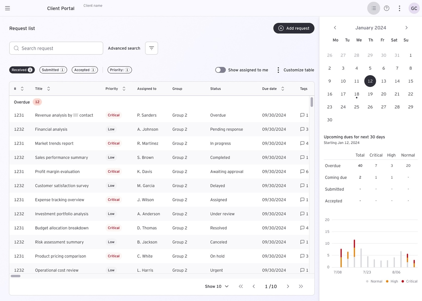
Redesigned Active Platform (After) Unified Dashboard

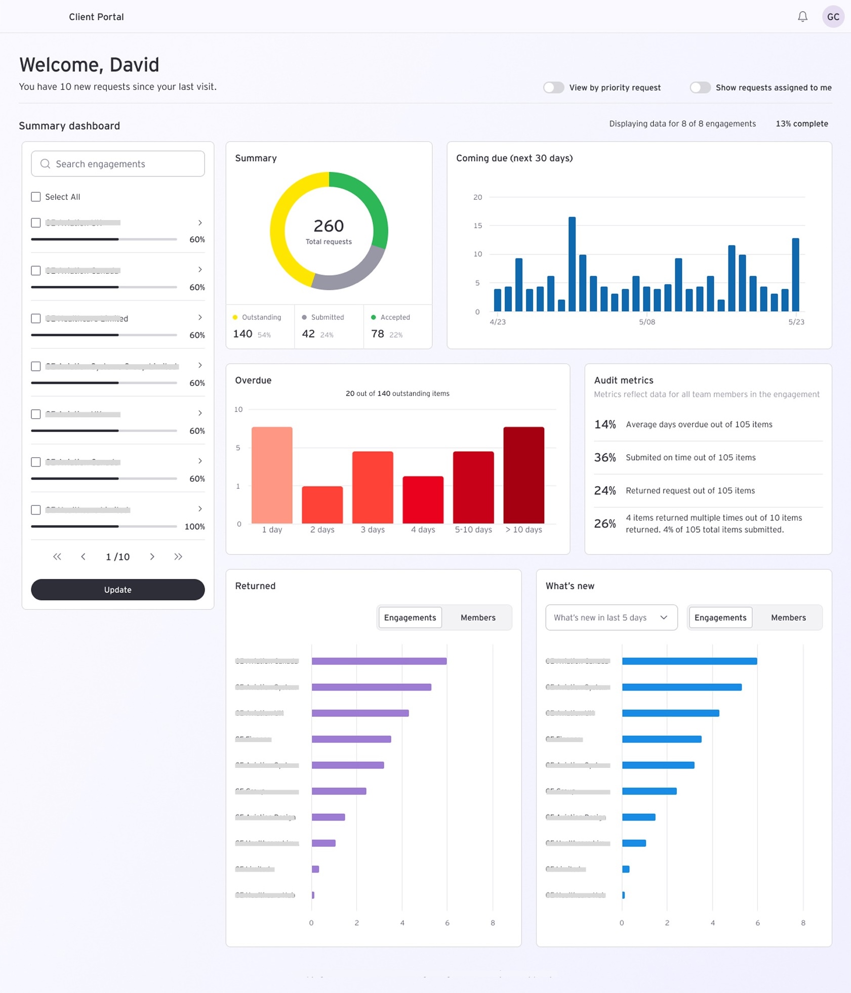
The Clarity Window: A high-fidelity task dashboard grouping action items transparently by immediate priority (Overdue, Coming Due, Active Stream). Real-time progress confirmation loops sync across profiles instantly.
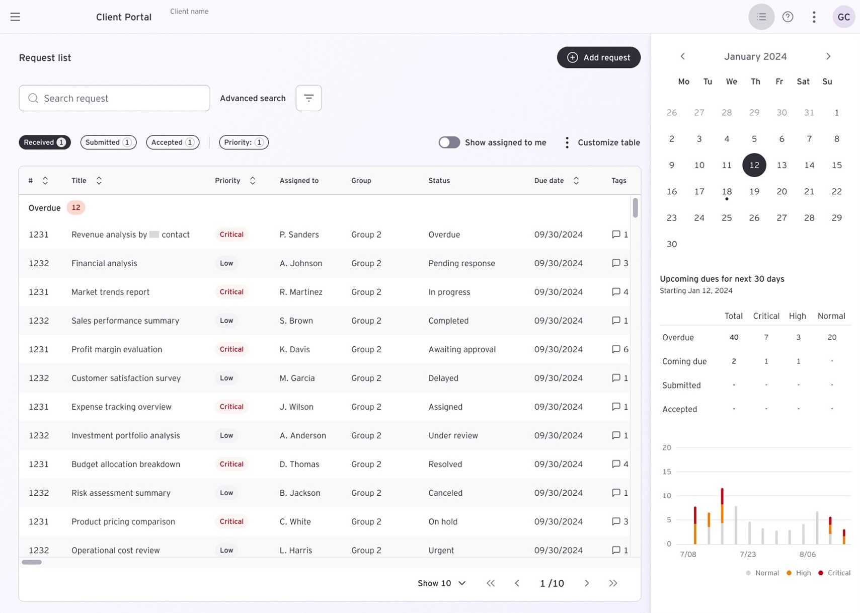
Client Portal wireframes and design exploration
Landing page redesign concepts
Landing page redesign for Strategic Manager - bringing key insights across engagements
Landing page redesign concepts
Landing page redesign for Operation Manager - bringing clarity to overdue, coming due, and outstanding items
07

How it affected users and the business

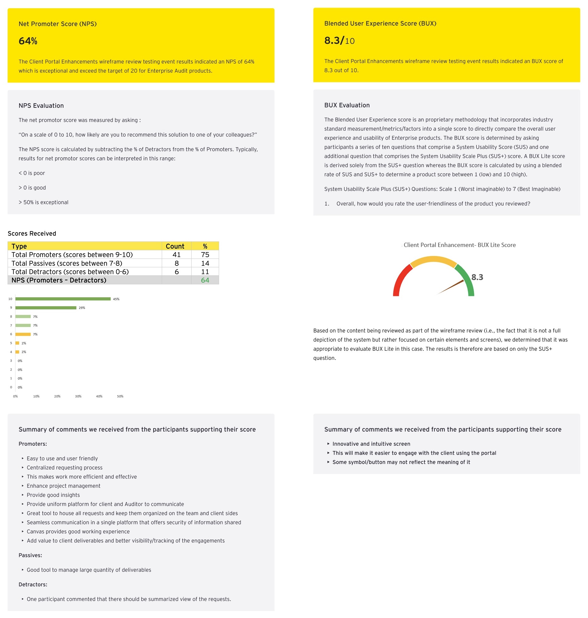
Measured post-testing via structured BUX evaluation, NPS survey, and benefit realization framework

45%
Blended UX score uplift
post-redesign (BUX)
From baseline to 8.3/10 - a substantial improvement across the System Usability Scale and the proprietary EY BUX methodology.
50%
Usability metrics
improvement
Across navigation findability, task completion rate, and error recovery - measured in comparative usability testing sessions.
64%
Net Promoter Score
Target was 20
NPS of 64% is classified as exceptional for enterprise audit products. The original target was 50.
87%
Agreed clients will directly
benefit from the features
82%
Said it would save
100+ minutes per engagement
80%
Agreed multiple assignees
improved client experience
21%
Year-over-year growth in
CX platform activity

9,224 instances of client feedback were recorded across 2,765 client accounts, a 5% increase in account penetration year-over-year. The redesigned platform did not just score better in testing. It was being used.
Users recognized the portal as a more intuitive and efficient way to manage audits, improving communication, transparency, and project coordination. This translated into stronger client relationships, reduced audit-team effort, increased business differentiation, and a foundation for future growth across additional service lines.
08

What I learned

This project reshaped how I approach enterprise redesigns, particularly the relationship between the stated problem and the real one, and between testing a concept and testing an assumption.

01
Infrequent users need a fundamentally different mental model
Designing for regular users and infrequent users requires different principles. Infrequent users need experiences that feel intuitive on every visit, without relying on memory or prior system knowledge.
02
Email is not the enemy, it is the benchmark
Users preferred email for its simplicity and directness. The portal succeeded when we designed for the same experience, not just feature parity.
03
Systems thinking over feature thinking
Mapping the end-to-end audit journey revealed opportunities that feature-level design missed.
04
Stakeholder consensus built before design prevents rework
Gaining buy-in across diverse stakeholders was time-intensive, but early consensus prevented costly redesigns and ensured on-time delivery.
05
Cross-geography research is not optional for global enterprise products
Research across APAC, US, and EMEIA revealed distinct user mental models, making global validation essential to avoid designing for a single region's needs
06
The brief is a starting point, not a scope
What looked like a navigation problem was actually a visibility and trust problem between auditors and clients. Solving the right problem made the difference.
Next case study
Tax Notice Guided Flow - Salesforce
View case study →