Enterprise UX Payroll Compliance-Critical Workshop Facilitation Product Design

Paystub Download
& Quick Totals

Downloading 50 pay stubs shouldn't take 12 minutes, but in a system where data is siloed and APIs aren't built for bulk, that was the reality. My task was to move the needle from weeks of manual labor to minutes, without compromising the strict compliance standards required by law.

Client ADP
Timeline Mar – May 2026
My Role Lead Product Design
Platform Global Payroll Platform
Enterprise Payroll cover
Estimated hours saved per admin per month
15+
Adoption rate within first 2 weeks
78%
Download Time Reduced
87%
Support Ticket Reduction
64%

01 - Context & Background

A compliance-critical
gap in payroll platform

Two types of practitioners rely on it daily : COS (customer service) teams managing payroll on behalf of clients, and client HR administrators running their own. When either group needs pay stubs for legal, audit, or offboarding purposes, the stakes are immediate and the margin for error is zero.


The feature needed to achieve parity with legacy platform, which already supported bulk download. The gap wasn't just a UX inconvenience, it was leaving COS teams exposed to weeks of manual labor for every legal or DOL audit request.

Dimension
Context
Platform
Enterprise payroll web app
Primary Users
COS payroll practitioners + Client HR administrators
Use Cases
Employee lawsuits, DOL audits, state compliance, client terminations
Current Reality
One-by-one manual extraction - up to one week per request
Target State
Bulk download with smart filtering - 15 to 20 minutes per request
02 - The Problem to Solve

One by one, all week long

When a client received a DOL audit notice or an employee filed a lawsuit, a COS practitioner would open iReports, search through a PDF that could contain 25,000 employees, extract individual pages, and repeat for every pay period across years of history. Modern application improved the interface but not the loop.


And the compliance pressure was real. Incorrect pay statements don't just create operational delays in states like New York, they create legal exposure. A wrong statement can end in a lawsuit. That's the environment in which this feature needed to work flawlessly.

The Core Problem
"It used to take a week at least when data was older. Imagine if they asked for a longer period, then data's not in iReports, you have to extract it from archives, and then again you go through one file at a time, look into all the pages."
— Manager CSMPS, Customer Service
Artifact : Current State: The One-By-One Download Loop
RECEIVE REQUEST Audit / Legal OPEN iREPORTS Legacy system SEARCH EMPLOYEE in 25,000-person PDF per pay group EXTRACT PAGE(S) PDF viewer trick SAVE FILE 1 pay period at a time MORE PERIODS? ×52 weekly payroll/year REPEAT FOR EACH PAY PERIOD DELIVER via AGS 1wk ⚠ Outdated tool, no batch support ⚠ Manual page extraction per period + If data >3 years: manual archive retrieval required - additional delays MODERN APPLICATION REMOVED THE IREPORTS DEPENDENCY BUT THE ONE-BY-ONE LOOP REMAINED · 12 MIN FOR 50 STUBS · 1 WEEK FOR HISTORICAL REQUESTS
Current state: no batch selection, manual per-period extraction, 52 repetitions per employee per year Discovery Phase · Workshop Analysis
01
Manual Loop, No Batch Mode
One download per pay period. No multi-select. No date range download. For a single employee with three years of weekly payroll history, that's 156 individual downloads.
Operational Burden
02
Compliance Stakes Are Extreme
Pay statements are legally binding. States like New York audit payroll formatting. An incorrect or incomplete statement in a lawsuit or DOL audit creates direct financial and legal exposure for the employer.
Compliance Risk
03
Two Tabs, One Workflow, Zero Sense
Payroll Results (internal use) and Pay Statements (external, compliance use) lived in separate tabs for technical reasons. Practitioners had to switch context for actions that felt identical from the outside.
UX Friction

03 - My Role & Collaboration

From workshop to working solution

Product Designer · Payroll Platform

I led end-to-end UX design for this feature, from facilitation of the Design Thinking workshop through research synthesis, concept exploration, and final UI. The hardest design work wasn't the screens. It was navigating the tension between what practitioners needed, what compliance required, and what the iPay API could actually do.


My responsibilities spanned: mapping and critiquing the current-state workflow, leading empathy exercises with COS practitioners, creating three design concepts for critique, user testing, and synthesising findings into a simplified final direction that diverged from my initial hypothesis.


  • Facilitated Design Thinking workshop: empathy mapping, define, ideate phases
  • Produced three design concepts; led collaborative critique to surface trade-offs
  • Tested with 5 HR administrators; pivoted direction based on findings
  • Collaborated with engineering on iPay API constraints and PDF generation performance
Collaboration Ecosystem
PM, Compliance
Deep compliance expertise. Defined the legal boundary between Payroll Results (internal) and Pay Statements (legally binding). Critical voice on iPay API constraints and state-specific formatting requirements.
Manager, COS / Payroll Practitioner
Primary COS user representative. Provided the real-world detail that made the pain point undeniable : managing payroll, 1-2 requests per week, the one-week timeline for historical data.
Client HR Manager / Payroll Practitioner
Primary client user representative. SME, Design Validation.
PM, National Account Payroll
Aligned feature decisions with payroll product roadmap. Advocated for tab consolidation from a product simplification perspective.
UX Lead
Co-facilitator
Engineering Team
Early technical feasibility discussions. Flagged iPay API limits for bulk operations and defined the sequential-calls-with-progress-indicator approach as the MVP path.

04 - Discovery & Research

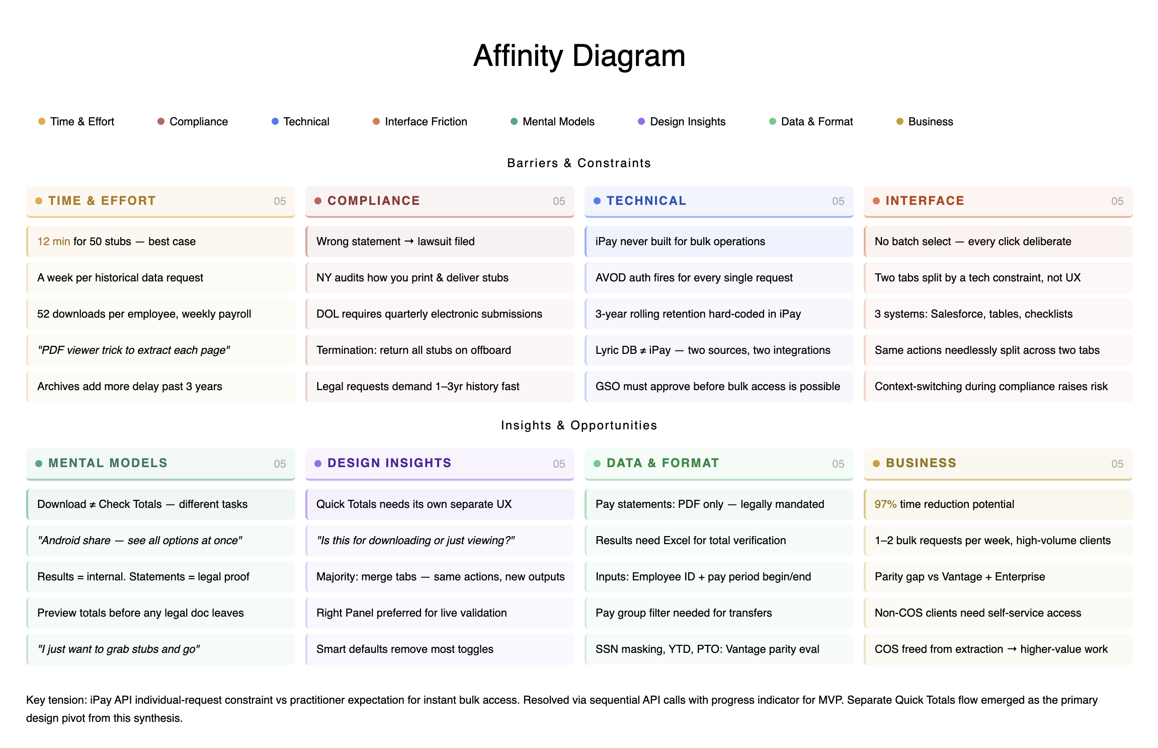
Three findings that changed the design

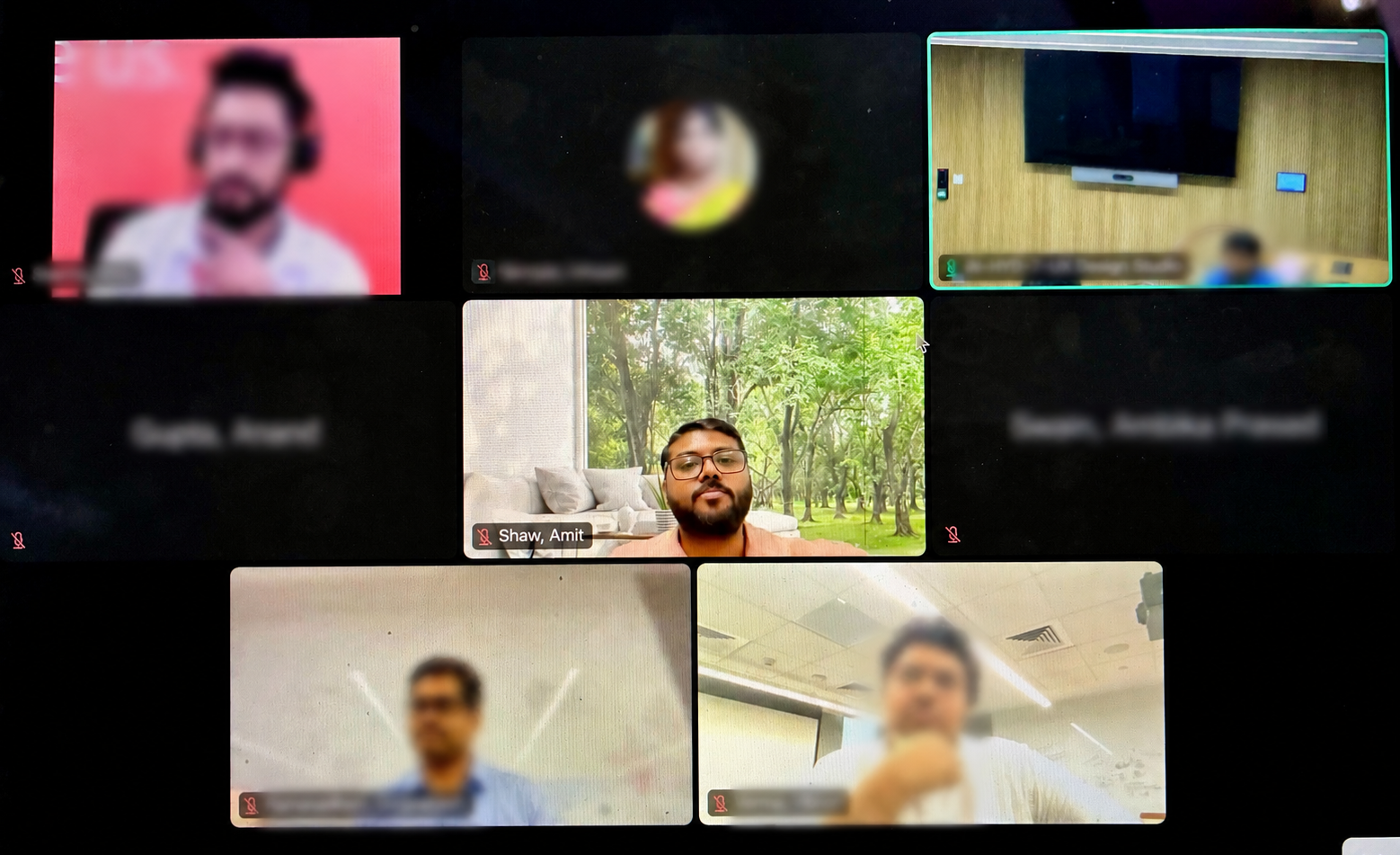
The Design Thinking workshop ran for 90 minutes with five participants across compliance, COS operations, and product. The most important insights weren't in the initial problem statement - they emerged from the debate.


Finding 01 : Two Distinct Mental Models
Users come to download documents or to verify totals. These are separate cognitive tasks. Designing a single unified interface for both created confusion, not convenience. This finding drove the eventual separation of Quick Totals from the bulk download flow.
Finding 02 : Payroll Results ≠ Pay Statements
Payroll Results are internal - used for reconciliation, available in Excel. Pay Statements are legally binding, external-only, always PDF, governed by state compliance rules and produced via the iPay API. Mixing them in a single interface wasn't just confusing, it was a compliance risk.
Finding 03 : iPay API Was a Hard Constraint
The iPay system never supported bulk operations. Each statement request goes through AVOD authentication individually. Any bulk solution would require sequential API calls, meaning the UX needed to handle graceful loading states rather than instant delivery.
"Just imagine the interface on your Android or Apple, when you share a picture, you see all the options at once. Bluetooth, hotspot, all of it. Why do I have to toggle through multiple screens when the use case is the same?"
COS Manager - on consolidating the download experience
"Pay statement is always for external usage. There are states like New York where they audit how you print a pay statement and give it to your employee. It can lead to a lawsuit being filed."
Compliance PM - on the legal weight of the feature
"Preview before commit workflow to prevent irreversible errors, while also leveraging knowledge from legacy application to recommend including valuable data like YTD balances and PTO details"
UX Lead - on the value of real-time validation
Research Scope
  • 8 user interviews · COS and non-COS practitioners
  • Competitive analysis: Legacy Application, Enterprise bulk download patterns
  • Design Thinking workshop: 90 min, 5 cross-functional participants
  • Usability testing: 5 HR administrators on 3 design concepts

05 - Three Concepts Explored

The right answer required the wrong ones first

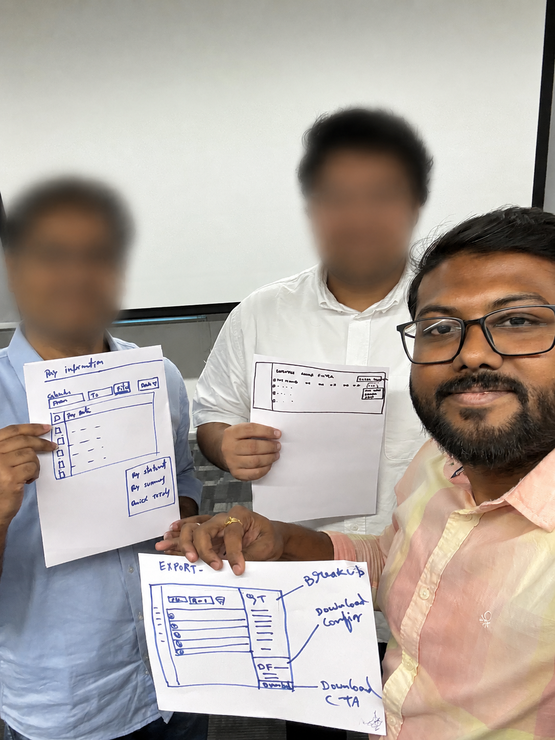
The workshop generated three distinct design directions. Each was sketched, critiqued in group session, and ultimately tested against real users. The process of elimination was as important as the final direction.

My initial hypothesis : that a unified modal combining bulk pay statement downloads with pay summaries would be a 'one-stop shop', failed during usability testing. Users were overwhelmed by the mixing of download actions and data viewing. That 'failure' was essential: it proved that the internal (payroll) and external (pay statement) workflows were fundamentally different, confirming that our design needed to be de-coupled to meet both user needs and compliance standards.

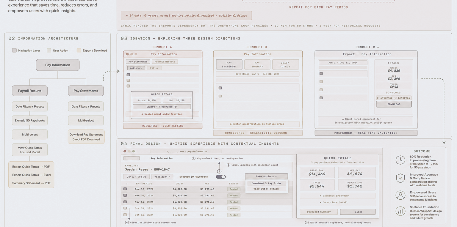
Artifact : Design Thinking Workshop: Three Concepts Sketched and Critiqued
Pay Information Pay Statements Payroll Results Actions ▾ Filter QUICK TOTALS Gross: $4,820 Net: $3,290 Export ▾ / Download PDF ⚠ Nested modal added friction DISCARDED - USER TESTING Pay Information PAY STATEMENT PAY SUMMARY QUICK TOTALS Date Range: Jan 1 - Dec 31, 2024 ⚠ Button proliferation as feature grows CONSIDERED - SCALABILITY CONCERN Export · Pay Information Jan 1 - Dec 31, 2024 TOTALS Gross $4,820 Net $3,290 Taxes $948 DOWNLOAD ● Internal ○ External DOWNLOAD ⚠ Right-panel component required investigation with Waypoint design system PREFERRED - REAL-TIME VALIDATION CONCEPT A CONCEPT B CONCEPT C ★
Three design directions critiqued against usability, technical feasibility, and compliance constraints Design Thinking Workshop · Ideation Phase
Concept A
Toolbar with Modal
Discarded
Gmail-style toolbar with action buttons. Multi-select opens a modal combining Quick Totals, download format, and pay statement generation in tabs.
Testing showed confusion: "Is this for downloading or just viewing data?" Nested modals for pay statements added friction rather than removing it.
Concept B
Three Segmented Buttons
Considered
Three independent action buttons : Pay Statement, Pay Summary, Quick Totals - each launching its own modal. Clearest separation of use cases, fastest path per task.
Button proliferation risk: as feature scope grows with future tax statements and W-4s, this pattern breaks down. Deferred, not abandoned.
Concept C
Right Panel with Live Updates
Preferred Direction
Split-screen: left panel for filtering and selection, right panel updating totals in real time. Single Download CTA with conditional configuration based on Internal vs. External selection.
Best for error prevention, "preview before commit" aligned with stakeholder mental model. Considered as new design pattern - required Design system & Pattern team investigation for right-panel component.

06 - The Final Solution

Separate the tasks. Simplify each one.

Two separate tabs, focused experiences, each optimised for its distinct use case, turned out to work better than any unified approach.

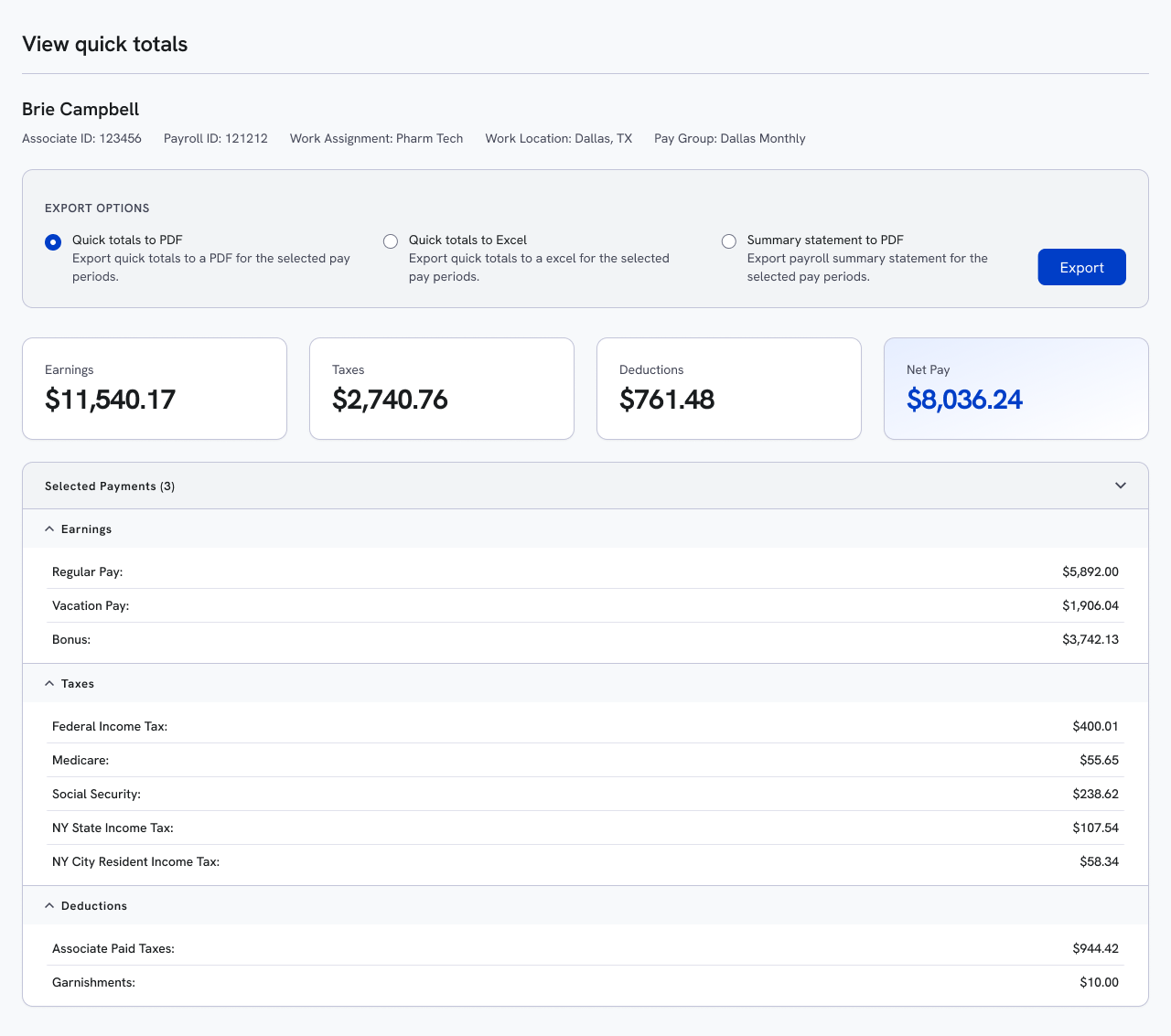
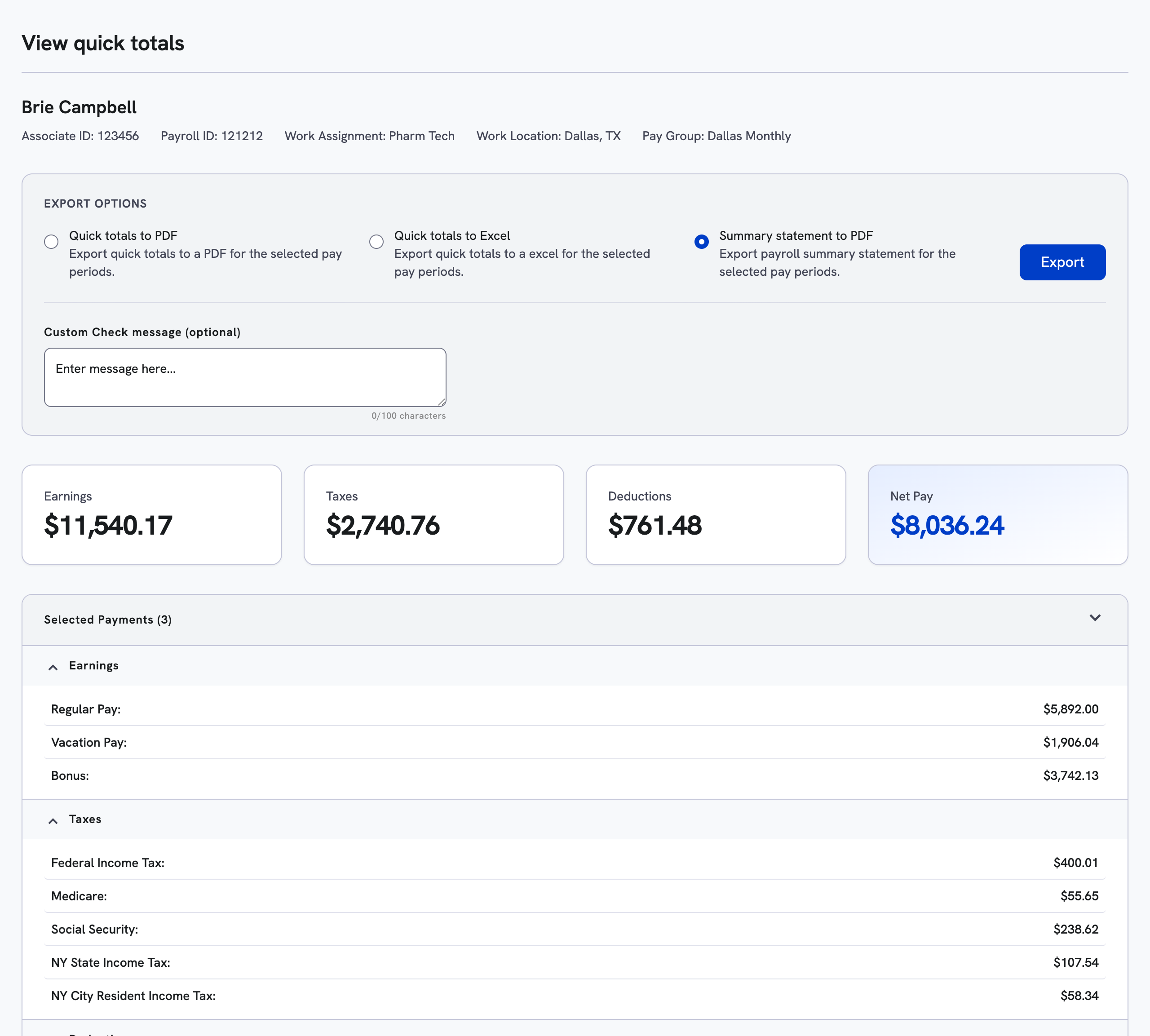
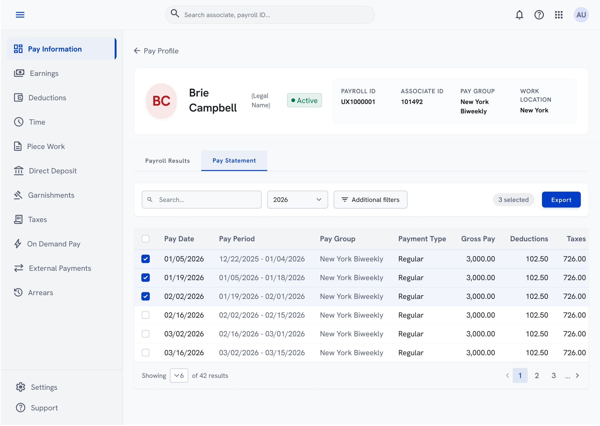
The key design principle wasn't "put everything in one place." It was "make the 80% use case invisible." For Pay statement bulk downloads: filter, select all, download. For Pay summary statement : filter, select all, view Quick Totals. A focused modal showing aggregate figures from selected periods, with options to export.


Information Architecture
Navigation Layer User Action Export / Download Pay Information Payroll Results Pay Statements Date Filters + Presets Exclude $0 Paychecks Multi-select View Quick Totals Focused Modal Export Quick Totals → PDF Export Quick Totals → Excel Summary Statement → PDF Date Filters + Presets Multi-select Download Pay Statement Direct PDF Download
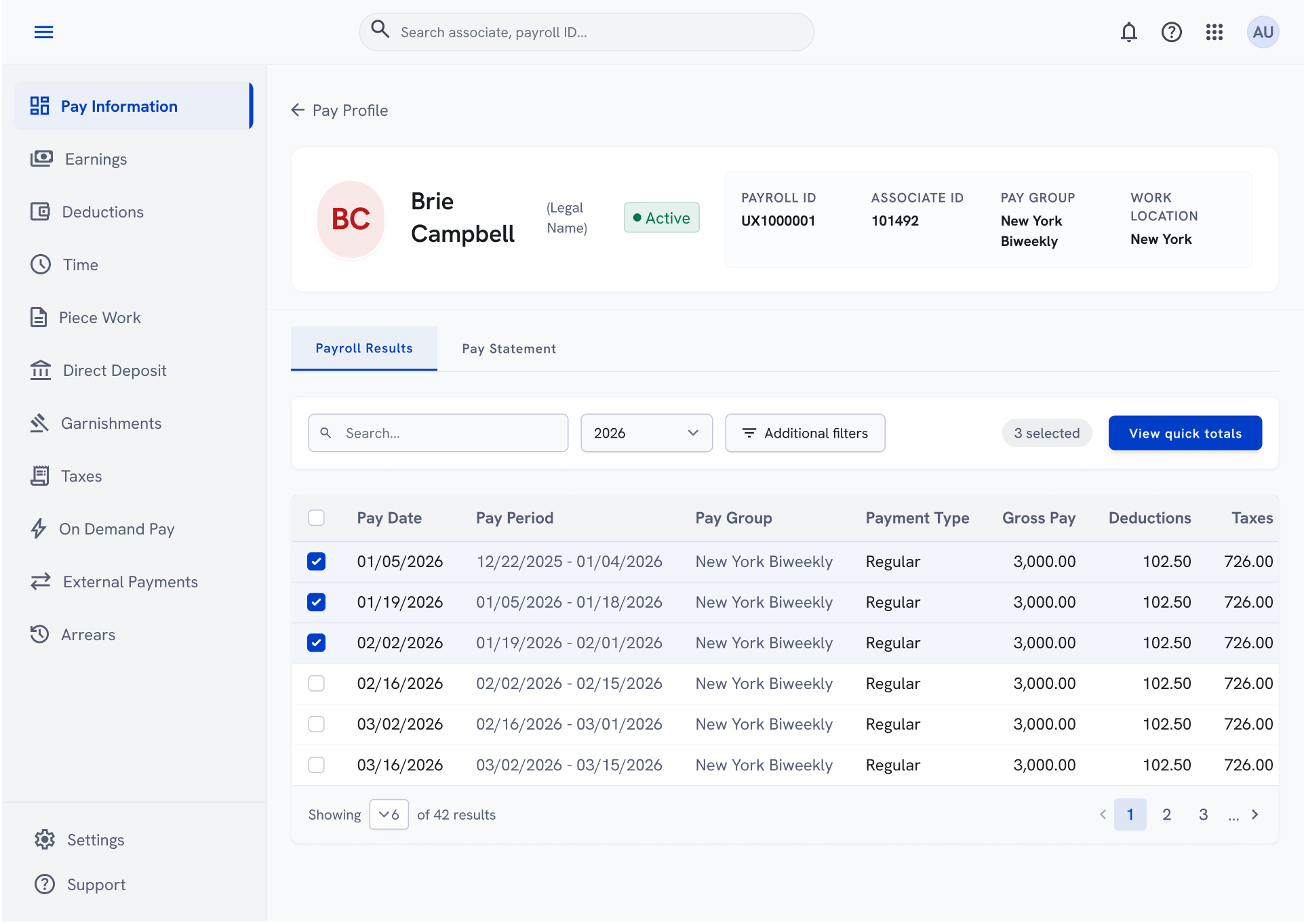
Final Design: Pay Information Page + Quick Totals Modal
Payroll Results screen Quick total modal

07 - Challenges & Concepts Not Pursued

Honest about what didn't work

Three of the most important design decisions in this project were decisions not to build something. Each discarded direction taught something that improved the final solution.

Concept Discarded
Unified Tabbed Modal

The initial concept bundled bulk downloads, Quick Totals, and detailed breakdown into a single modal with tabs, plus configuration options for SSN masking and YTD toggles. Round one user testing was unambiguous: "Is this for downloading or just viewing data?" Configuration options felt overwhelming for what users described as a quick task. We separated the use cases entirely and removed redundant controls.

Deferred - Not Abandoned
Unified "Payroll Results + Pay Statements" Table

The majority of workshop participants wanted the two tabs merged into one. The technical reality : different data sources, different legal treatment, and upcoming tax statements requirements, made this premature for MVP. The two-tab approach was kept with a documented roadmap for consolidation pending engineering assessment.

Technical Constraint
Right Panel with Live Updates

Dynamic Right Panel concept failed to survive the realities of our design system’s governance and the high engineering cost of building unsupported, non-standard patterns. Instead of forcing a novel UI, we pivoted to scalable, platform-consistent solutions that prioritized maintainability and a shippable experience.

08 - Impact & Outcomes

From a week of manual work to under two minutes

The metrics were not aspirational targets set at the beginning of the project. They were post-launch measurements taken after two weeks of live use. The numbers validated that separating use cases had been the right call.

87%
Download time reduction
12 min → 1.5 min (50 stubs)
64%
Fewer support tickets for bulk payroll tasks
78%
Adoption rate within first 2 weeks post-launch
92%
Feature retention : users who tried it, came back
User Impact · Payroll Practitioners
Weeks-long legal audit preparation reduced to under 20 minutes
COS teams estimated 15+ hours saved per admin per month
Self-service capability removed dependency on COS support team
COS practitioners reported reduced anxiety during audit deadlines
Business Impact
230+ unique users accessed Quick Totals in the first month alone
Support ticket volume for bulk payroll tasks dropped 64%
Payroll application achieved feature parity with Legacy Enterprise products
DOL audit and termination offboarding workflows became self-service
Qualitative Feedback
"I used to dread tax season - now it's so much faster."
"I love that I can see the totals without downloading anything."
Clients practitioners reported less reliance on ADP support for routine tasks

09 - Reflections & Learnings

What this project changed about how I design

01

Configuration Is Often a Signal of Unclear Requirements

Our initial design was cluttered with redundant toggles for SSN masking, YTD options, and formatting controls that simply replicated rules already enforced by policy or law. This taught me that when you find yourself piling on settings, you’re failing to leverage smart defaults; design shouldn't ask users to configure what the system should handle automatically.

02

Test the Simplest Concept First

I tested the complex unified modal in round one because I assumed simpler flows needed less validation. They don't. They need it more, because the design has fewer places to hide when assumptions fail. Testing a simple multi-select → download flow first would have established a baseline faster and led to the pivot earlier.

03

Simplicity Is the Output of Discipline, Not Shortcuts

The final design looks obvious in hindsight, but it was forged through rigorous testing, discarded concepts, and the deliberate decoupling of complex workflows. Simple interfaces aren't the absence of complexity; they are the byproduct of difficult decisions.

Next case study
Audit Issue Tracker Redesign
View case study →